64 of 69
Mandelbrotcafe – branding
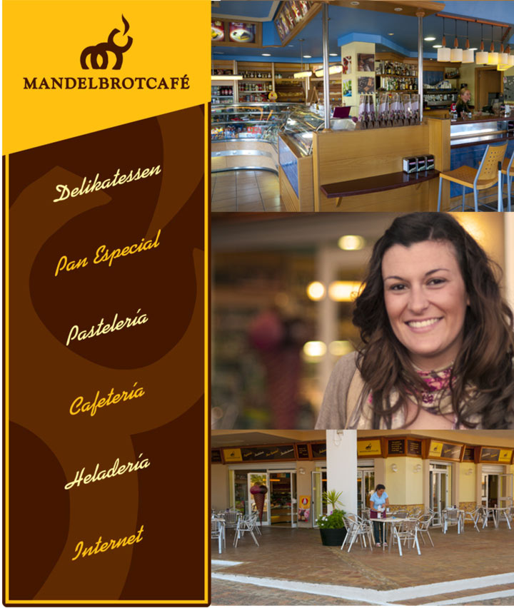
Branding and interior design of probably the nicest cafe in town. International cake recipes, especially german ones, special bread, internet, wifi, books, food store,...Madelbrotcafe has everything you would expect from a modern coffee shop. And it had to look welcoming, friendly and natural. The name is quite long and complex to pronounce, not good, according to academics and marketing rules. But it stands out as "different" and "foreign", even "german". The fact is that it breaks with the image of all those cheap cafes around which usually serve bad quality products. "Mandel" means almond in german, an essential ingredient for cakes and pastries. "Brot" means bread due to the fact that it is a bakery store which sells special bread. Mandelbrot also stands for mathematician Benoit Mandelbrot, inventor of the mandelbrot fractal, very famous on the internet, which in some part looks similar to a famous german pastry called "Bretzel". At the same time the graphical part of the logo is basicly made of three C´s which stand for the initials M and C. The upper C acts like a steaming cup of coffee. It is also a family business being the family symbol an elefant which is also shown in the graphical element .


